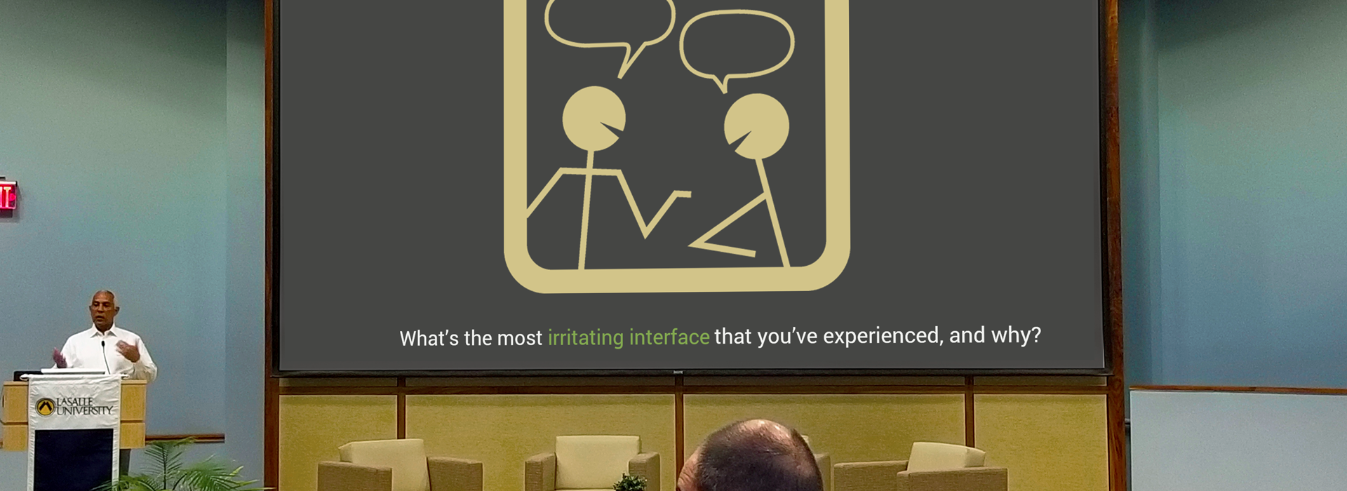
During a workshop that I facilitated at LaSalle University, I asked the audience to take some time to think about and discuss the most irritating interface that they have experienced, and why. I posed that question to set the tone for the workshop. The most common answers I obtained involved “things were difficult to find, cluttered page layout”, “the website (or interface) was not optimal for the device I was using”, “sudden, unannounced changes in the interface”, and “everything I wanted to accomplished required some kind of workaround”. When an eLearning event does not function properly, or when the selected learning technology is not in accordance with learners' needs, we create confusing, complex or inconsistent interfaces that create bad learning experiences, or no learning at all. Designing for learning and developing online learning experiences with seamless interfaces is extremely important to provide and promote appropriate learning.
Instructional Design and eLearning Development are no exception when it comes to the need for good practices in UX and UI. Today we, learning professionals, must integrate UX/UI principles in every learner-centered instructional design. In today’s world of education and training, our design should accommodate for 21st Century Skills (Griffin and Care, 2015). Learners are no longer passive information receivers; learning experiences should encourage critical thinking, exploration, collaboration and flexibility among other skills. That means that not only the technology used for learning experiences should provide the means for those skills, but equally important is to ensure that the use of learning technologies by learners should not become learning experiences in themselves.
Characteristics of Good Instructional Design that Acounts for UX/UI

In the same fashion that there are several approaches and frameworks for instructional design, there are multiple ways of approaching the design and development of learning interfaces and experiences. There is no one right way to go about designing learning technologies (Chorost, DiGiano and Goldman, 2009). However, there are several basic elements that are common in good interface and experiences in learning, independent from the instructional design model or framework used. Some of those characteristics are presented below.
Instructional designers have a clear understanding of the unique challenges involved in designing or selecting learning technologies. Software developers must consider usability when developing interfaces. Game designers must integrate knowledge of how a consumer engages and derives fun from a game. Like software developers and game designers, instructional designers must also take into consideration usability and engagement. However, unlike software or game developers who design interfaces for public consumption, instructional designers must also take into consideration how people learn when designing learning experiences. The focus of usability and engagement are on facilitating learning that is expected to translate into knowledge acquisition, actions or change. The instructional designer must create learning experiences that balance educational value, usability and learner engagement.
Design thinking is a crucial part of the instructional designer. The title “Instructional Designer” has the word design in it. That should imply that design thinking is part of the day-to-day life of the work performed by instructional designers. Design thinking in learning is more than designing materials or applying learning sciences to learning materials (Ideo LLC 2012). That is particularly true when we want to use a learner-centered approach to learning experiences. Below are a few examples of how design thinking plays a major role in learner-center design. These examples do not involve the use of learning materials. Instead consider the environmental and other factors that influence the learning experience:
- A teacher lowered the bulletin boards in the classroom so that his 2nd grade students could actually see the content he’d spent hours assembling.
- A company built an “innovation room”, where employees can actively collaborate, learn and innovate and grow their own ideas.
- A graduate class that used to be exam-based is now a project-based class, where learners collaborate in group projects.
- A learning and development department integrated a community of inquiry approach to hybrid learning. During the virtual sessions of the learning events, the facilitator acknowledges and uses the social presence of the learners for interactive activities.
- A high school in Hawaii collected the needs and interests of learners, teachers, and families and engaged the larger community to imagine new solutions that could help the school be more effective.
Instructional designers think expansively and without constraints when brainstorming during the design ideation process. When properly structured and facilitated, brainstorming sessions can provide great new and fresh ideas to the learning experience design. The key is proper structure and facilitation. That means that the instructional designer ensures that the session remains within its goals and objectives, invites people who represent the diversity of the learners (including people outside their team), and maintains the right focus and energy by providing proper space and timing for brainstorming sessions.
Characteristics of Learner-centered eLearning Development that Accounts for UX/UI
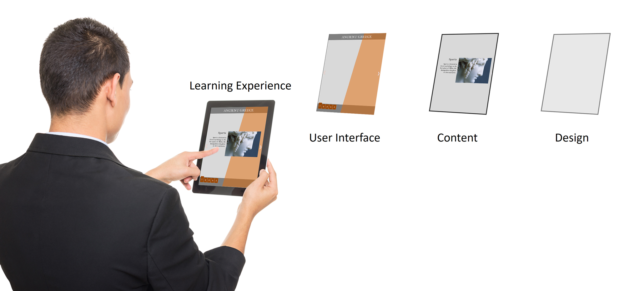
An eLearning developer makes online learning experiences a reality. The developer of the online experience (in some instances is the same person who has the role of instructional designer) uses authoring tools, LMSs, LRSs and other technologies to produce a suitable learning experience as per the instructional designer guidelines. eLearning developers must have an understanding of the different media used for the learning experience. Smartphones are different devices than desktop and laptop computers. Tablets are different from smartphones and augmented reality devices. Each of these media have their own challenges, their own constraints, and their own conventions. However, interfaces for most-to-all devices are based on the basic computer premise of input-processing-output.

The eLearning developer creates learning interfaces with direct manipulation. The interface involves continuous representation of objects of interest together with rapid, reversible, and incremental actions and feedback (Hutchins, Hollan and Norman 1985). This allows a learner to manipulate objects presented to them, using actions that correspond at least loosely to manipulation of physical objects. The direct manipulation of objects in online learning can encourage exploration, ensures proper navigation of the content, and promotes interactivity.
The design of the online learning interface is invisible to the learner. A good learning interface design would make its inputs, states, and outputs discoverable, clear, and efficient to use. The calls to actions, navigation objects and interactions are clear and consistent through the entire learning event, so the learner can concentrate in learning the content of the course instead of figuring out how to navigate or what is expected of them.

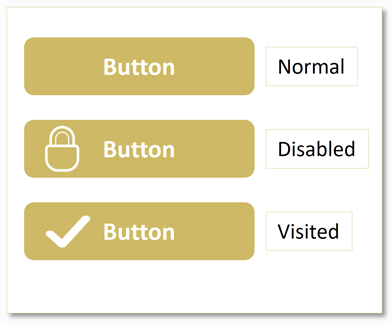
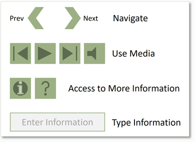
The eLearning developer defines clear affordances for the learner’s inputs and outputs. Affordances are the actions that are possible for a learner to take while interfacing with the online course. The learner recognizes the opportunity for information to be communicated to/from the interface. The interface provides signifiers, which are sensory or cognitive indicators of the presence of an affordance. Signifiers are perceivable cues about the affordances with a designed object. In eLearning interfaces, well designed affordances direct the learner to interactions, navigation, entering information, and other calls to actions seamlessly. We include signifiers to specify how learners discover the possibilities of affordances in the interface and communicate where a given action should take place.
Test Usability (UI) and Learnability (UX) with a Cognitive Walkthrough
Even after strongly following usability guidelines and best practices, every eLearning interface and learning experience should always be tested. A cognitive walkthrough is a method to evaluate the effectiveness of the learning experience that is based on having evaluators inspect a user interface. It involves a team of reviewers walking through each step of a task flow and answering a set of prescribed questions, with the goal of identifying those aspects of the interface that could be challenging to new learners (Lewis, Polson, Wharton and Reiman 1990). Unlike heuristic evaluation methods, this methodology provides an advantage for identifying improvements in instances when access to learners or resources for usability testing may be limited by having new users instead of expert analysts participating in the evaluation (Dykstra 1993).
Cognitive walkthroughs are meant to evaluate learnability. Though there are simplified versions of this methodology, they are most effective for systems with complex, new, or unfamiliar interactivities and functionalities (Wharton, Reiman, Lewis and Polson 1994). This methodology is best used during the development of a new system to uncover design problems that could hinder its learnability for new users. It is not recommended for established interfaces that correctly employ standard design patterns. Cognitive walkthrough is just one way of evaluating design and should ideally be coupled with other methods to ensure a comprehensive understanding of the effectiveness of a learning interface design.
An effective cognitive walkthrough evaluation requires:
- A defined learning audience – This methodology is not intended for the general public that correctly employs standard design patterns.
- A prototype of the course – It is important that to perform this evaluation when the course design is at the prototyping phase.
- Top tasks for UX Design – Top Tasks are a tool used to focus the team on the same, best set of user tasks.
- A facilitator – The facilitator performs each task and stops at each new screen or other discrete step in the interaction.
- Participants who will act as evaluators – Evaluators offer their interpretation of how a particular type of learner would perceive the interface and behave in the given situation.
- A recorder – The recorder documents the answers found for each question and the probable success or failure of the overarching task.
For each task, the facilitator performs the task and stops at each step in the interaction or screen. Then the evaluators establish whether the learner is likely to succeed at this step of the course navigation. During the evaluation, testers uncover potential causes for failure using analysis criteria as defined by 4 guiding questions:
- Will the user try to do the right thing?
- Will the user know what’s possible to do with the interface?
- Will the user find the right action for their goal?
- If the user does the right action, will they know they succeeded?
The evaluators make a determination as to whether the user will pass or fail at each step. If any of the questions results in a determination of “No”, the entire step would be marked as “Fail” by the recorder. After all steps have been evaluated, the group summarizes fail points and discusses next steps.
The most important part of this evaluation is using the information found through the walkthrough to address all the pain points in the learning experience. As the designer, this is not an opportunity to explain, defend or “sell” the design, but to look for ways of improving it by integrating the feedback obtained by the evaluators.
In future articles, I’ll discuss other methodologies used to enhance the learning experience by improving interfaces.
References
- Ausubel, D. P. (1968). Educational psychology: A cognitive view. New York: Holt, Rinehart, & Winston.
- Cathleen Wharton, John Reiman, Clayton Lewis, Peter Polson. 1994. The cognitive walkthrough: A practitioner’s guide. In Jakob Nielsen, Robert L. Mack (ed.) Usability Inspection Methods, John Wiley & Sons Inc, New York, New NY. DOI: https://dl.acm.org/doi/book/10.5555/189200
- Chorost, Michael., Chris. DiGiano, and Shelley V. Goldman. Preparing for the Next Generation of Learning Technology Designers. Educating Learning Technology Designers : Guiding and Inspiring Creators of Innovative Educational Tools. New York: Routledge, 2009. Web.
- Clayton Lewis, Peter Polson, Cathleen Wharton, John Reiman. 1990. Testing a Walkthrough Methodology for Theory-Based Design of Walk-Up-and-Use Interfaces. In Proceedings of the SIGCHI Conference on Human Factors in Computing Systems (CHI ’90), April 1-5 1990, Seattle Washington USA, Association for Computing Machinery, New York, NY, 235-242, https://dl.acm.org/doi/10.1145/97243.97279
- Dykstra, D. J. 1993. A Comparison of Heuristic Evaluation and Usability Testing: The Efficacy of a Domain-Specific Heuristic Checklist . Ph.D. diss., Department of Industrial Engineering, Texas A&M University, College Station, TX.
- Edwin L. Hutchins, James D. Hollan & Donald A. Norman (1985) Direct Manipulation Interfaces, Human–Computer Interaction, 1:4, 311-338, DOI: 10.1207/s15327051hci0104_2
- Griffin, Patrick E. and Care, Esther. Assessment and teaching of 21st century skills: methods and approach / Patrick Griffin, Esther Care editors Springer Dordrecht 2015.
- Hoadley, C. and Cox, C. What Is Design Knowledge and How Do We Teach It? Educating Learning Technology Designers : Guiding and Inspiring Creators of Innovative Educational Tools. New York: Routledge, 2009. Web.
- IDEO LLC. Design Thinking for Educators, 2nd Edition. Open source toolkit. http://designthinkingforeducators.com 2012. Web.
- Interaction Design Foundation. What are Affordances? (information is always updated).
- Interaction Design Foundation. What are Signifiers? (information is always updated).
- Norman, Don. The Design of Everyday Things: Revised and Expanded Edition, Basic Books, 2013. ProQuest Ebook Central
- Salazar, K. 2022. Evaluate Interface Learnability with Cognitive Walkthroughs. NN/g Nielsen Norman Group. https://www.nngroup.com/articles/cognitive-walkthroughs/

