Course Makeover - Revenue Cycle Operations
- Client: RCO Department
- Software: Articulate Storyline, Adobe Capivate and Photoshop
- Categories: eLearning development, instructional design, visual design, multimedia learning, project management
The department of Revenue Cycle Operations (RCO) trains staff on several tasks regarding entering and processing insurance information. Employees must identify and enter patient insurance information with extreme accuracy. Every employee is required to take core courses on basic use of the system and customer service skills. Then employees proceed to take courses that pertain to their area of specialty. I was in charge of redesigning the instruction for all their online courses (25 in total), developing all the e-learning courses, job aids and other resources, and assisting in organizing the courses in learning plans in the LMS, based on specialty.

Project Highlights

The main objective of the curriculum was imparting a variety of soft skills (customer service) and hard skills (procedural software) to employees that process patient accounts. I used Articulate Storyline through most of the project. I used Adobe Captivate for software-related training that included interactive demonstrations and simulations (at the time, the current version of Storyine did not provide features for that purpose that were robust enough). All the graphics, videos and audio were processed in Camtasia Studio Adobe Photoshop and Audacity.
We used documentation tracking software and spreadsheets to track all project communication and progress. We did not use project management software as per client's request. The course reviewers (which consisted of several directors and supervisors) expressed concerns about lacking skills to use the software.
At the time when I intervened the trainings were provided live using PowerPoint presentations. The presentation slides were my starting point to study the content and make recommendations. During the discovery phase of the project, I found that the current content was up-to-date, although the clients were expecting an upgrade of their patient information system (Epic). The organization has a department dedicated to Epic support, inclusing training. That means that the portion of the training content of that software was outsourced to that department.
Challenges and Constraints

All course content was provided in the form of PowerPoint slides containing:
- Cropped screenshots of the software
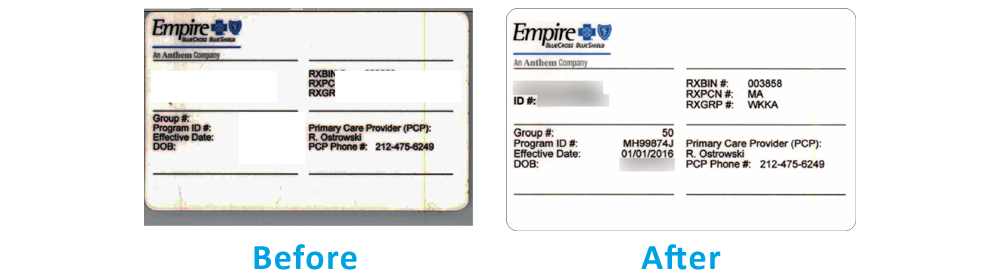
- Poorly processed scans of insurance cards
- Content with very long sentences, too many bullet point lists, inconsistent graphics and no branding
- No clear instructions for user interaction, inconsistent prompts and times for the user to interact throughout the courses
- Misuse of multimedia – poorly placed audio and videos, and in different formats
There were three important constraints to consider in the development of the e-learning courses. They were:
- Due to HIPAA regulations, real patient information cannot be used for examples. This poses a challenge when teaching how to identify group and member numbers.
- I didn’t have access to the insurance processing software, and there weren’t any accounts in the software created for training purposes. The client committed to provide additional screenshots if needed.
- It was decided that no considerations for mobile learning would be given. At the time, there were no mobile versions of the software.
My Approach to the Project

In order to provide employees with context to their learning, I developed a curriculum with several paths. Each path contains the basic courses that every employee must take, and the courses pertaining to their area of specialty. That gave employees a “road map” of the professional development that is expected in their particular area of expertise.
For the user experience, I created branding for the courses that is consistent with both the design guidelines of the organization, and also consistent with the insurance entities that provide the policies and procedures to make claims. Presenting each lesson within the road map keeps them from being overwhelmed with too much new information all at once. The visuals in each course place the learner in the part of the process they are learning, providing them with a consistent sense of direction.
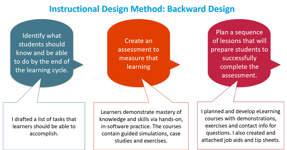
I used an backward design approach to the courses instructional design. Insurance processing is not exactly an entertaining topic. However, the client emphasizes the need for reinformcing attention to detail and accuracy on reading and entering insurance information. To that end, I created several exercises to help learners identify the minor differences between the different types of insurane cards.
The current visuals for the courses were inconsistent and poorly designed. For example, some sample insurance cards were images of scanned patients' cards with the personal identifiers covered. Some of the scans covered parts of the cards that were being discussed in the lesson, rendering the visual communication inefficient. I had the insurance cards re-scanned, and I used Photoshop to blur protected patient information, making sure that the cards still contain the pertinent information for the lessons.
The advantages of this approach are:
- A consistent, polished, professional look and feel that follows the organization's design guidelines
- The graphics and illustrations provide consistency in the message for each lesson, and a road map to locate the lesson within each part of a process.
- Presenting the information in this way make it easier for the employee to apply their knowledge on the job.
- “Show, don’t tell” approach. This provides the right context for the learner, providing the necessary information and practice from the perspective of the user.
- Hands-on practice provides the opportunity for the learner to immerse in using the software instead of just staring at screenshots.
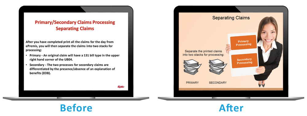
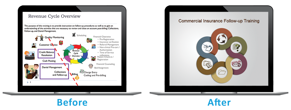
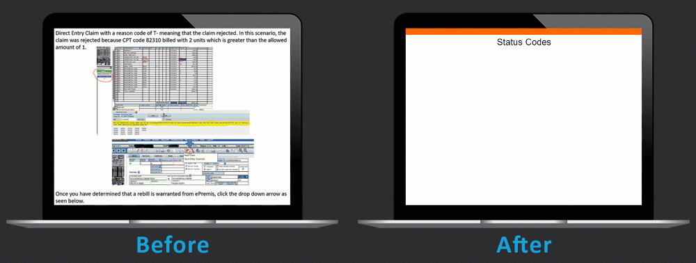
Below are before-after screenshots from selected courses.
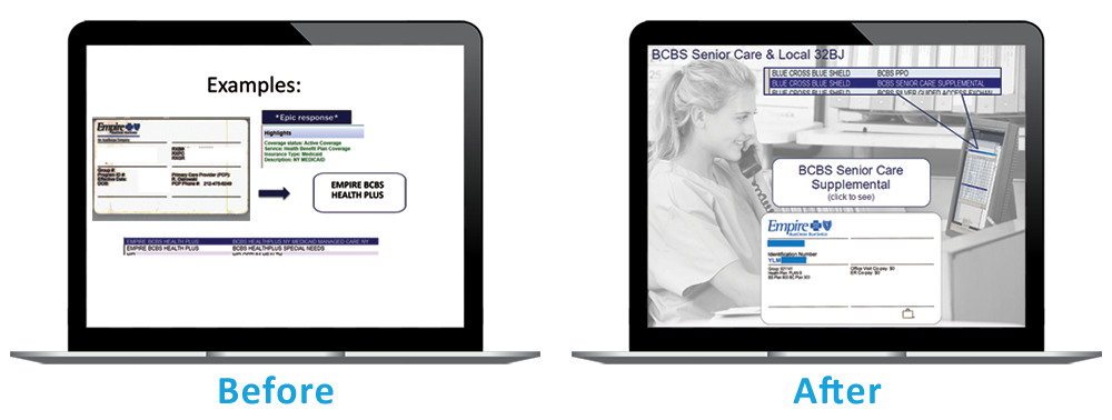
The visual and graphic design of the course make the use of photoshopped slide backgrounds of the organization offices and facilities, providing learners an engaging and relatable visual context.
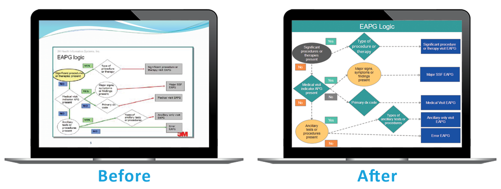
There were several process flowchart demonstrations that assist insurance processors decide which actions to take for different situations. I made the flowcharts interactive. The interactivity adds the benefit of chunking the content for better management of learners' cognitive load.
I used scenarios for the course on processing paper insurance claims. The scenarios replicate real life situations and help the processor decide the actions to take for different scenarios.
The slide layouts were redesigned to comply with design principles for multimedia learning. I also considered dual-code theory as well as cognitive load theory. The result are clean, visually appealing slides.
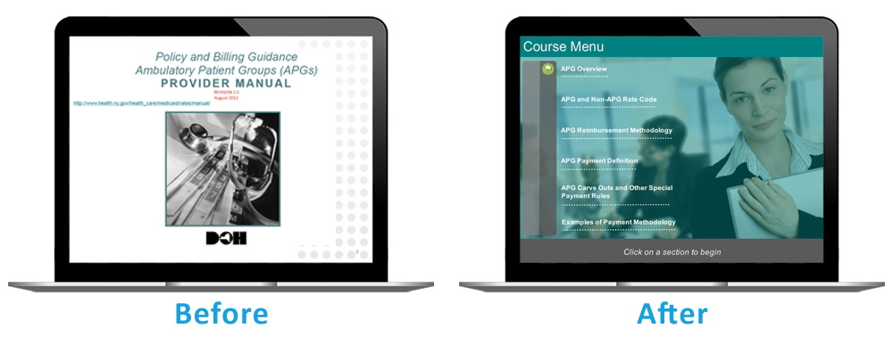
The added interactive menu in the course introduction serves as a navigation roadmap and as an advanced organizer for the learner.
I processed the software screenshots to create simulations.