Community Health Worker Curriculum - Online Learning Development
- Client: 1199SEIU Training and Employment Funds
- Software: Articulate Storyline, Adobe Photoshop, Adobe Captivate, Camtasia Studio
- Category: web, creative, photography
Course Features
The reasons for including them, and the benefits that they provide
Navigation that Invites Exploration
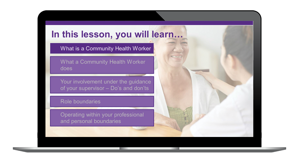
Each lesson is largely navigated via one main menu and submenus that branch to each topic in the course. The visuals of the menu provide colors and enabled/disabled states of the menu items, to reveal the portion of the course that the learner will be introduced to. The narration of the course provides an additional layer of guidance for the learner to know their progress in the lesson.

Benefit
Besides the attractive, responsive design of the menu system itself, it gives learners the freedom and flexibility to further explore once each topic is covered. The design invites learners to preview a topic. The visuals (the checkmark showing that a topic has been completed, along with the use of colors to point at the next topic to discuss) guide the user through the lessons and let the user know their progress.
Illustrative Scenarios
Encouraging action and decision making

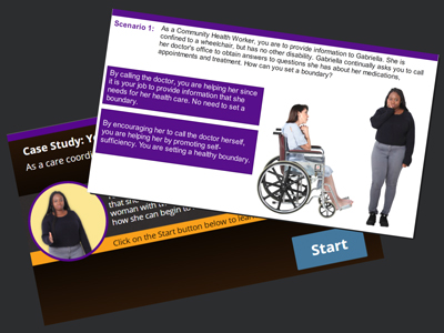
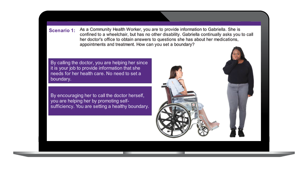
We show simple scenarios “acted out” in a minimalist design right on the stage of the curriculum. Immediately thereafter, learners are asked to decide whether the behavior they’ve just seen conforms to the point being presented.
Benefit
Presenting content in a context as close as possible to the situations that learners will face on the job is critical both in inspiring interest in the course, but also in processing the information presented. In this course we used photos of real-life people, all of which helped make this course a visual and contextual success. Additionally, scenario-based education is effective in opening live discussions in a blended media environment.
Providing Context Using Meaningful Visual Design
Showing learners concepts in action, as opposed to reading about them

How many people have you met that say that they are a “textual learner”? Our design contains integrated visuals and interactions to maintain a higher level of engagement from the learners. Text takes time to read and it is boring to look at. But perhaps worst of all, when an audience is given text, they will, out of habit, attempt to read it. As they do so, the narrator will be talking and they won’t be listening - because they’re reading. Narrated bullet points impair the ability to learn*. Therefore, this course has been designed with the intention of maintaining interest, high engagement and above all, effective learning.
Benefit
Incorporating imagery and interactivity to replace narrated text and dreadful bullet points help making sense of what the learners are listening. It also accommodates for learners with a lower level of literacy understand concepts that otherwise they wouldn't understand by simply reading directions.
Graphically-presented Questions
Designing questions for knowledge retention

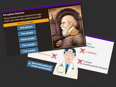
Rather than just asking a knowledge question the traditional way, multiple choice questions were created as illustrated case-based questions to provide clues on what the right answer can be.
Benefit
Just like with the scenario-based knowledge checks, we use interaction and visuals rather than presenting them with just text or narration. This adds the benefit that visuals provide throughout the entire course.
More than One Narrator
Using vocal variety as a way to engage learners and add interest
Each lesson is narrated by two different narrators. Giving the eLearning course more than one voice for narration offers a wide range of advantages, including a boost in user engagement and knowledge retention. The script is natural, conversational, but also educational and clear, created to stimulate active listening, using pauses and silence effectively.
Benefit
In a long course (please keep in mind that this is a 3-month long course), variety and “mind breaks” are necessary to maintain learner engagement. Using vocal variety in the narration increases interest and “refreshes” the level of attention that the learner invests in a given lesson.
Why does this course work?
Involving Theme - The entire course is based on the idea that learners get to uncover information and knowledge that they already have that can help them become CHWs.

Many Short Lessons = One Big Course - The shorter lessons let users get in and out more quickly. This keeps them from being overwhelmed with too much new information all at once. They can build upon existing knowledge by dipping into the experiences they have. The navigation helps them quickly find the lessons they are learning.
Rich Visual Design - The attractive visual design and large, widescreen stage make the whole course very appealing, but also considers and accommodates for different learning styles.
Good Illustrations of Concepts and Scenarios - We illustrated concepts by showing people in real situations rather than just talking about them. Those details and visuals keep learners interested and engaged. Scenarios provide a safe space to fail that helps build the capacity to fix mistakes as learners would in real life.
Results
This approach to instructional design has proven to provide a high level of engagement, faster course completions, and, complemented with live discussions and in-classroom facilitation, it becomes an integral part of a rich education experience.
As of December, 2020, the 1199SEIU Training and Employment Funds has trained over 450 CHWs.
Selected Course Screenshots
Below are selected screenshots andd sample interactions of the courses, to demonstrate the UX/UI and visual design of the courses.

Each course contains menus that serve as advanced organizers that remind learners of what they already know and help them organize the new information they're about to take in.

The aesthetic quality of the course design is integral to make it useful, as the courses we use every day affect the quality of the work performed by the CHW. The visual design of the course is in accordance with the commonly accepted design principles of multimedia design.

The Universal Design for Learning framework is fundamental in the design and development of interactive learning wich content addresses issues of equity in healthcare. Representation is integrated in the design, by providing identifyers and considering that learners differ in the ways that they perceive and comprehend information that is presented to them (slide created in Articulate Storyline).

The courses use interactive scenarios to support active learning strategies such as problem-based or case-based learning. Learners working their way through a storyline, usually based around commonly known situations related to the work that the CHW performs to assist clients.